Typography
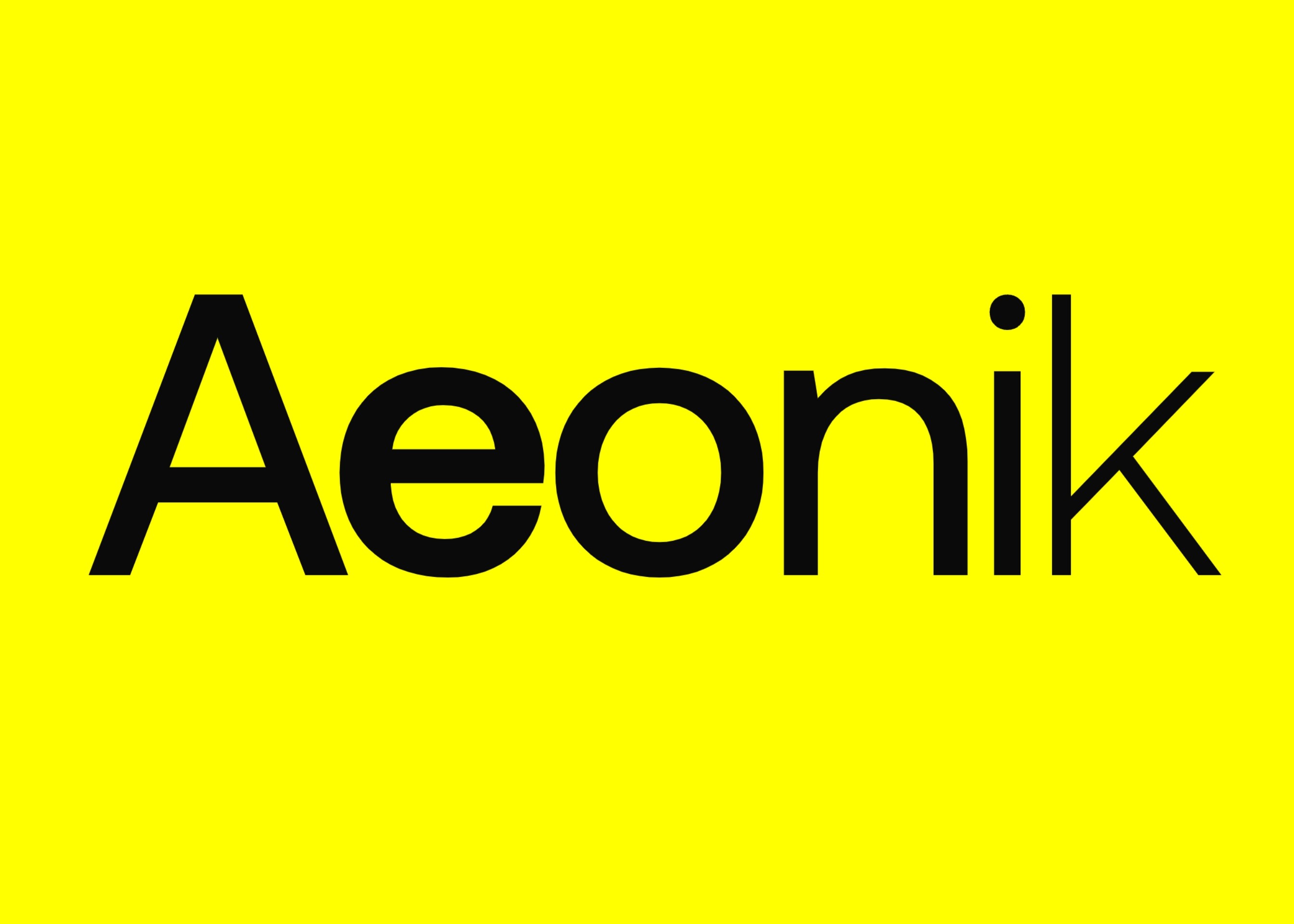
Aeonik: The first collaborative font family
by Mark Bloom and Joe Leadbeater
Feb 17 2024
With Modernist roots but details referencing mechanical early Grotesks, Aeonik positions itself as a Neo-Grotesk with a Geometric skeleton; with proportions that are wider than a typical Grotesk, but thinner than a typical Geometric Sans. Structurally, this creates a fantastic balance for both display and text use.
Seven broad weights (based on the Pablo distribution) are provided with enough difference in weight to give appropriate hierarchy. Optical adjustments have been made to ensure each weight can sit next to each other.
Aeonik also offers vast character sets across each weight, with all Western European diacritics, Punctuation, Mathematic & Numerics. Opentype features allow multiple subsets, caps alternates, tabular and lining numerals, both proportional and old-style.
Although Italics appear oblique, curves and diagonals have been corrected to ensure weighting stays true to their upright counterparts. Slightly thinner stems allow the appropriate stress that italics provide within text.


