Brand Identity
AD-REM and Maiarelli Studio’s brand for
no-alcohol aperitif iessi is impossible to miss on the shelf
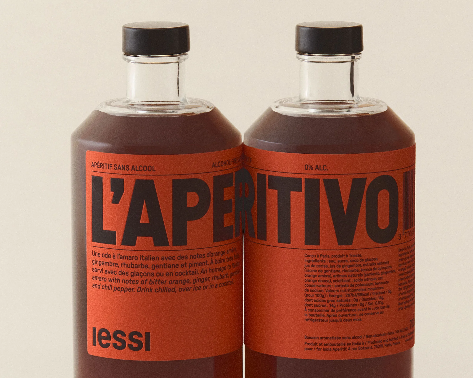
The creative process that led to the entire world of iessi – a burnished orange alcohol-free aperitif with somewhat of a mixed heritage – was not the most straightforward. When Nicolas Maiarelli, founder of iessi, locked down on an amaro recipe from his Friulan nonna and tweaked it to perfection, he turned to a troop of creatives to help bring his vision for the drink to life. Referred by Maiarelli Studio, Nicolas brought in Florent Gomez Siso, Founder & Creative Director of independent practice AD-REM, to create the labels that wrap around the bottles, an exercise that led the designer to craft the custom punchy typeface seen on the labels, and eventually, also design the wordmark.
To give the labels a standout look that would also be flexible, Gomez Siso created a responsive design system, allowing the layout to be consistent for different bottle sizes, and versatile enough to be adapted for new products to come. But no matter the shape or size of the bottle, the name of the aperitif sits pride of place at the centre of the label, set in IESSI SANS, Gomez Siso’s custom typeface. The forms of the headline typeface take cues from the works of French painter, commercial poster artist, and typeface designer Cassandre, remembered for his many creations, including the iconic YSL monogram. “There is this sense of incredible elegance and approachability in his work, something that talks about quality and taste. His use of strong condensed typography, like his work for Dubonnet, has been my main inspiration when drawing IESSI SANS,” shares Gomez Siso. “I wanted to design a typeface with a lot of attitude facing an exciting future with a zest of French history.”
The typeface, indeed, is the star of the label, calling attention to the bottle with its confident visual tone. When the label design was locked in, the scope of the project widened to also include the wordmark. “What is interesting is that I designed the wordmark after designing the labels. It was a rare opportunity to be able to design a logo that is the result of the design system and not the other way around,” shares Gomez Siso. For the wordmark, the designer turned to GT Pressura, “with its rounded corners that offer a lot of contrast to IESSI SANS; the typeface is also very legible in small sizes,” he notes. Set in all lowercase, the wordmark lends the brand a certain character and presence, without clashing with the product name, set in all capitals. The colour palette too adds to the drink’s sense of style and drama, with a rich shade of orange as the hero hue. “The idea was not to contrast with the liquid in the bottle but to compliment it,” Gomez Siso tells us. “This particular shade of orange stays strong both in natural daylight or low light environments, and also gives the bottle a lot of confidence and a sense of luxury.”
As Gomez Siso zeroed in on the label design and the wordmark, the project’s collaborative nature took over the process – designer and art director Leila Cicic took notes from the label design to create a website, rich in editorial-esque details. Cicic opted for a predominantly white website with bursts of the brand’s orange hue, and included trilingual options to speak to the iessi heritage. Meanwhile, Giona Maiarelli, Founder of Maiarelli Studio, created a launch campaign to finally push the drink into the digital ether. He handed the reins to art director and set designer Laura Doardo and photographer Alecio Ferrari to create a set of “at once richly saturated and clean-lined” images for a series of posters, each of which has as much “character and presence” as the aperitif itself.


